 appuza
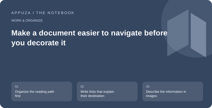
Organize the reading path first
A document's visual polish cannot compensate for an unclear structure. Start by asking what the reader needs to find, understand and do. A project brief might need the purpose, deliverables, schedule and contact route. Give those sections descriptive headings in a logical order. A reader scanning the outline should be able to predict where an answer belongs. If every heading says something broad such as “Overview,” the structure is not doing enough work.
Use the editor's actual heading styles rather than making ordinary text larger and bold. Google's accessibility guidance recommends headings as a way to organize documents and support navigation. The practical advantage is that structure can remain meaningful beyond the page's visual appearance. Keep the hierarchy simple and avoid skipping levels for cosmetic reasons. A short document may need only one level of section headings. The goal is understandable relationships, not a complex outline that makes a two-page brief feel like a textbook.
Write links that explain their destination
A link labeled “click here” depends on the surrounding sentence to explain its purpose. A more descriptive label, such as “Download the event schedule,” gives the reader useful information on its own. This helps when links are scanned separately or when a person returns to the document looking for one resource. Keep the wording concise and distinguish links that lead to different versions of the same material.
Check whether the destination is accessible to the intended audience. A descriptive link to a private file still fails for an external reader. If access is restricted for a reason, state that context. Avoid presenting a download as though it were an ordinary webpage when the distinction matters. For a long document, internal links to sections can help, but they should supplement a clear structure rather than compensate for a disorganized one. Test the links in the final format you plan to share.
Describe the information in images
An image description should convey the information the image contributes to the document. For a chart, the important content may be the trend and the key comparison rather than the colors of the bars. For a screenshot, it may be the location of the control needed for a task. Google's documentation explains where alternative text can be added and recommends checking automatically supplied descriptions. Automatic text may identify objects without explaining why the image matters in this document.
Do not make the image the only place where a critical instruction appears. If a screenshot shows which setting to select, name the setting in the surrounding text. This helps readers who cannot view the image, use a small screen or encounter a changed interface. Decorative images do not need a long narrative that distracts from the actual content. Decide whether the visual carries information, and write accordingly. The purpose is equivalent understanding, not a description of every visible pixel.
Keep tables about data
Use a table when the reader needs to compare values or relationships across rows and columns. A table with a clear header row can be more useful than a dense paragraph. Avoid using tables simply to position text in a decorative layout. That can create a confusing reading order, especially when the document is exported or viewed through assistive technology. Google's guidance makes the same distinction between data tables and visual layout.
Keep tables as simple as the information allows. Long merged-cell structures may look compact but make it harder to know which heading applies to a value. If a table needs extensive explanation, consider splitting it into several smaller tables or introducing the comparison in prose. Check whether a table remains readable on the smallest likely screen. A reader should not have to remember a distant column heading while scrolling through a long sequence of values. Repeat context through clear labels where the format permits.
Do not make color carry the whole message
A red row and a green row may look different to you without communicating a clear difference to every reader. Add words such as blocked, complete or needs review. The labels also help when the document is printed in grayscale or copied into another tool. Use contrast that remains readable and avoid very small text to fit more content onto a page. Space is not wasted when it helps the reader distinguish sections and follow the argument.
Check emphasis in plain text as a useful thought experiment. If the meaning disappears when bold, color and position are removed, the wording may need to do more work. This does not mean abandoning design. It means that design should reinforce a message already expressed clearly. A warning can have both a distinct visual treatment and a direct sentence explaining what action is needed. The combination is more dependable than a colored icon whose meaning must be guessed.
Review the actual shared artifact
If you will distribute a PDF, inspect the PDF. If you will share a live document, test the live link with the intended access level. Export can change pagination, links and the way structure is exposed. Use the available accessibility checks in the relevant tools, but do not treat an automated pass as proof that the document is easy to understand. Read the headings in order, follow the key links and check whether important images have meaningful explanations.
Invite feedback from readers who use different access methods when feasible, without claiming that a brief check represents every user's experience. Keep a contact route for reporting problems. Accessibility is part of ordinary editorial quality: clear structure, understandable references and information that survives changes in presentation. A useful document should let people find the answer and act on it without solving the layout first. Begin with those concrete improvements, then refine the visual design around the reading path.
Official references
These are editorial walkthroughs based on documented features, not claims of a completed device test. Product behavior can change. Send a correction.