 appuza
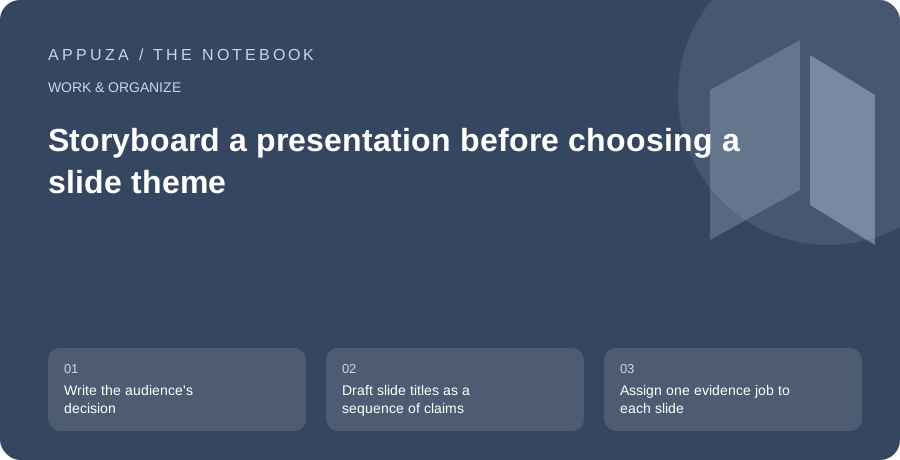
Write the audience's decision
A presentation should change what the audience understands or does. Begin with that outcome. “Explain the project” is broad; “Help the team choose between two launch dates” is concrete. Write the decision in one sentence, then list what the audience must know to make it. This gives the presentation a spine before you open a theme gallery. It also helps you remove interesting material that does not support the actual purpose.
For a launch-date discussion, the essential points might be readiness, unresolved risks, the cost of delay and the recommended choice. A history of every design revision may not belong in the main narrative. Keep supporting detail available for questions rather than putting it all on slides. The audience should not have to infer the decision from a collection of project facts. A clear purpose makes the presentation easier to edit because every slide can be judged against the same practical goal.
Draft slide titles as a sequence of claims
Write the proposed slide titles in a plain document. Use titles that say something, such as “The content is ready, but support coverage is incomplete,” rather than labels such as “Status.” Read the titles in order. They should form a coherent argument even before charts and images are added. If the sequence jumps between topics, fix the story at this stage when moving a sentence is cheaper than redesigning a finished slide.
A useful sequence for the example might establish the decision, show the current readiness, explain the remaining gap, compare the dates and state the recommendation. The exact number of slides should follow the complexity and available time. Avoid a fixed rule that every presentation needs a particular count. A short meeting may need three strong slides; a detailed review may need more. The important constraint is whether each slide advances the audience toward the decision without requiring unnecessary reconstruction.
Assign one evidence job to each slide
For every title, specify the evidence that supports it. A schedule claim may need a timeline. A comparison may need a table. A user problem may need a short example. Do not add a chart simply because it makes the slide look analytical. If a chart is used, define the measure and source. If the evidence is uncertain, state the uncertainty in the title or explanation rather than hiding it in tiny text.
In the launch example, a readiness table could distinguish complete, incomplete and unverified areas. That is more informative than a decorative progress ring with an unexplained percentage. Use an illustration when it clarifies a concept, not when it merely fills empty space. Empty space can help the audience focus. The storyboard should say what the viewer must notice on each slide and how that observation supports the next step in the argument. This keeps design choices connected to meaning.
If two dates have the same readiness risk but different staffing coverage, show those dimensions separately. A single overall score would hide why one option is recommended. The audience should be able to disagree with a weighting choice without losing access to the underlying facts.
Separate spoken explanation from slide content
A slide is not a transcript of everything you will say. Put the core claim and essential evidence on the slide, and keep elaboration in speaker notes or your preparation document. However, do not make the slide so cryptic that it becomes meaningless when shared afterward. Decide whether the deck must stand alone. A live presentation and a self-contained reading deck may need different versions or additional explanatory notes.
Rehearse the transition between slides. The audience should understand why the next point follows. If you find yourself saying “This is unrelated, but,” consider moving the material to an appendix or removing it. A presentation can contain several topics, but their relationship should be explicit. The storyboard is where you discover missing bridges, repeated claims and unsupported conclusions. Fixing those problems improves the talk more than changing fonts or adding animation to an argument that remains unclear.
Design for the viewing conditions
Once the structure works, choose a visual system suited to the room or device. Text that is readable on a laptop may be too small on a distant screen. Use clear hierarchy, sufficient contrast and labels that do not depend only on color. Google's accessibility guidance for presentations recommends meaningful alternative text and other structural practices. These are useful starting points, especially when slides will be shared beyond the live session.
Test the most detailed slide at the smallest realistic viewing size. If it cannot be read, simplify or split it. Do not compensate for a crowded slide by speaking faster. For charts, remove unnecessary decoration and make the key comparison visible. For screenshots, crop to the relevant area and identify the control or result the audience should notice. Keep motion purposeful. Animation can reveal a sequence, but it should not be required to understand a static export that the audience may receive later.
End with the action and the unresolved boundary
The final slide should make the requested decision or next step explicit. State who needs to act and what information remains uncertain. In the launch-date example, the recommendation might be conditional on support coverage being confirmed by a specified review point. That is more useful than a generic “Questions?” slide because it preserves the purpose of the discussion even if time runs short.
After rehearsal, remove material that does not change understanding or action. Keep an appendix for likely questions, with sources and detailed calculations where appropriate. Check the exported deck and any shared links before the meeting. A good presentation is a guided sequence of claims supported by evidence, delivered in a form the audience can follow. The theme helps make that sequence visible. It should not decide what the presentation is about or conceal the absence of a clear recommendation.
Official references
These are editorial walkthroughs based on documented features, not claims of a completed device test. Product behavior can change. Send a correction.